Othering and Projection: Chinese is confusing vs. Chinese are confused

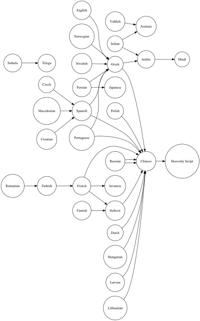
In English, a person says, “It’s all Greek to me,” when they do not understand the words of someone else. In Greek, when a person does not understand, they say it sounds like Chinese. Many languages have an expression that names another language as epitome of unintelligibility. It turns out that in a directed graph, most languages converge on Chinese as the unintelligible language.

Directed graph shows various languages as nodes with arrows pointing at other languages, eventually pointing to the 'Chinese' node. The 'Chinese' node points to 'Heavenly Script'.

This is understandable. Chinese writing, especially Traditional Chinese, is very visually complex. Chinese characters are logograms, which makes learning how to read Chinese difficult.

However, there is a difference between finding Chinese writing confusing and alleging that Chinese people are confused.
Read the rest of this entry »

In which Mark and Eduardo fulfill their yellow fever dreams

I wish all my news came in the form delivered by Next Media Animation TV.

Read the rest of this entry »

Posted in Videos, Visualizations. Tags: , , , , , , . Comments Off on In which Mark and Eduardo fulfill their yellow fever dreams

Canada’s Recent Immigrants’ Country of Birth, 2006

You can click on the map below to see a larger version.

World map. Place of birth of recent immigrants to Canada, 2006.
Read the rest of this entry »

Posted in Charts, Visualizations. Tags: , , , , , , , , , , , , , , , . Comments Off on Canada’s Recent Immigrants’ Country of Birth, 2006

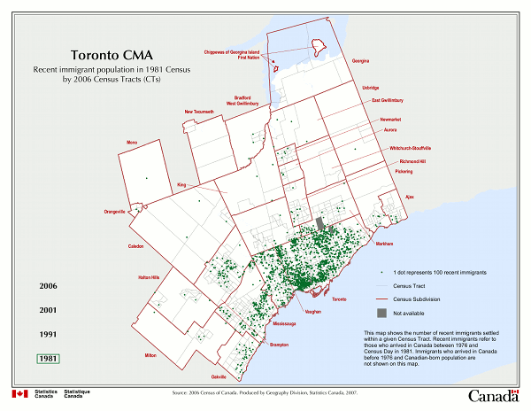
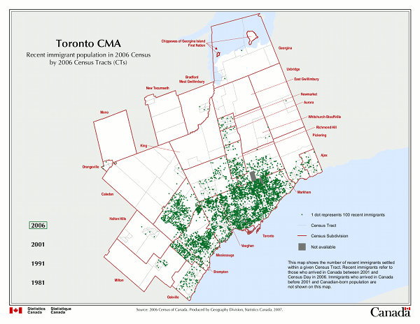
Map of Recent Immigrants in Toronto: 1981 versus 2006

For these maps, “recent immigrants” are those who arrived in Canada within the last five years of the Census date. You can click on the maps to see larger versions.

1981

Toronto CMA. Recent immigration population in 1981 Census by 2006 Census Tracts (CTs).

2006

Toronto CMA. Recent immigration population in 2006 Census by 2006 Census Tracts (CTs).

Via Recent immigrant population from 1981 to 2006 Census by 2006 Census Tracts (CTs) by Statistics Canada.


Related post:

Map of White Segregation/Enclaves in Toronto

Statistics Canada has a “thematic” map of the percentage of visible minorities in Toronto CMA (Census Metropolitan Area) in 2006. You can click on the map below to see a larger version. Generally, the lighter areas are where the whites live.

Toronto CMA. Percentage of Visible Minorities by 2006 Census Tracts (CTs). Map 2 of 2.

Toronto is a multi-racial city with a marshmallow centre (or two). The suburbs surrounding Toronto have a greater percentage of visible minorities, while large patches of Toronto’s core have been gentrified are inhabited by whites.

Note that some areas of Toronto are whiter than the national average, over 90% white.

Read the rest of this entry »